An ICO stores each image at a color depth from 1 to 32 bit, and transparency comes either from a 1 bit AND mask on older icons or an 8 bit alpha channel on 32 bit ones. The alpha channel is what gives smooth edges. The Univik ICO Converter writes a clean 32 bit ICO with alpha from your image.
Two icons that look identical in a preview can behave nothing alike once they are on the desktop. One sits clean on any background, the other drags a black square behind it. The difference is color depth and how the icon handles transparency, and both are set deep in the file.
Here is what the depths mean, how old icons and modern ones each deal with transparency and why that black square shows up.
What Color Depth Means in an ICO
Color depth is the number of bits used to describe each pixel, and it sets how many colors that pixel can be. One bit gives two colors and eight bits give 256, and the number climbs from there. The general idea is set out under color depth.
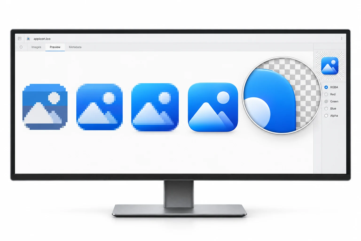
An ICO is a container, so each image inside it can carry its own depth. A tiny 16 pixel entry might sit at a low depth while the 256 pixel entry runs at full color. That flexibility is part of why one .ico can serve so many places at once.
The Depths, 1 to 32 Bit
Five depths cover the history of the format. The first four differ only in how many colors they hold. The fifth adds something the others cannot, a channel for transparency.
| Depth | Colors | Transparency |
|---|---|---|
| 1 bit | 2 | AND mask |
| 4 bit | 16 | AND mask |
| 8 bit | 256 | AND mask |
| 24 bit | 16.7 million | AND mask |
| 32 bit | 16.7 million | 8 bit alpha |
The old low depths are mostly history now, kept alive for legacy files and the smallest icons. Modern work runs at 32 bit. To understand why the early ones look the way they do, it helps to see how they draw a transparent edge.
How Old Icons Handle Transparency
An icon below 32 bit does not store transparency in its color data at all. Instead it keeps two bitmaps stacked together. One is the color image, called the XOR bitmap. The other is a separate 1 bit map, the AND mask, that says which pixels are see through. The ICO format reference spells out how the two combine.
Because the mask holds a single bit per pixel, a pixel is either fully present or fully gone. There is no in between value, which is the whole limit of the old approach.
What the AND Mask Does
The AND mask is a stencil. For each pixel it stores one value. A 0 means keep the pixel, draw the color from the XOR bitmap. A 1 means drop it and let whatever sits behind the icon show through. Windows applies the mask first, then lays the color image over the top.
That two step blend is where the names come from, the mask is combined with the screen and then the color is applied over it. The same trick even allowed an icon to invert the pixels behind it, a feature from the days of single color displays. What it never allowed was a soft edge.
The 32 Bit Alpha Channel
A 32 bit icon works differently. It is a 24 bit color image with an extra 8 bit channel bolted on, the alpha channel, which stores an opacity value for every pixel. The idea of blending an image by a separate opacity layer is described under alpha compositing.
Eight bits of alpha give 256 levels of opacity per pixel rather than the two of the old mask. A pixel can be fully solid, fully clear or anything between, so an edge can fade out gradually and a soft drop shadow can sit under the art. This is what lets a modern icon melt into any background instead of stamping onto it.
Why an Icon Shows a Black Box or White Halo
This is where depth stops being trivia. When a 32 bit icon lands somewhere that ignores its alpha channel or the icon was built without a matching mask, the transparent pixels have no instruction to be clear. They fall back to whatever the color data holds, and that shows as a solid black square around the art.
The pale cousin of the same problem is a white halo, left when an icon was flattened against a white background before the transparency was set. Both trace back to the same root. The transparency information is missing or being skipped. A proper 32 bit ICO with a correct alpha channel is what removes them.
Which Depth to Choose
For almost every job today the answer is 32 bit. You get true color and a real alpha channel in one image, which handles smooth edges and any background without a second thought. The lower depths save a few bytes and suit a monochrome or retro look, and little else.
The one honest caveat is very small sizes. At 16 pixels the difference between depths is hard to see, so a low depth entry can be fine there. The story of those early low color icons is told in the guide on old Windows icons. Going the other way, an icon's alpha survives a trip back to a PNG, which the ICO to PNG guide covers.
Build an ICO that carries a full alpha channel from your image, so the edges stay smooth and no black box or white ring follows the icon around.
Free Download See All FeaturesMake a Clean 32 Bit ICO
The reliable fix for depth and transparency trouble is to rebuild the icon from a source with real transparency, a PNG for instance, so the alpha comes through intact. The Univik ICO Converter does that.
- Start with a transparent sourceUse a PNG that already has a clean alpha channel.
- Load it in the converterAdd the image and choose the sizes you want.
- Export at 32 bitThe converter writes each size with its alpha intact.
- Check the resultOpen it in the free viewer to see the depth and sizes.
Starting from a picture and building the icon is walked through in the PNG to ICO guide, and the free ICO viewer reports the depth of each image inside a file. The wider format, sizes and all, is broken down on the ICO file page. And if an icon looks broken because someone only renamed a PNG, that trap is covered in the guide on a renamed PNG.
Frequently Asked Questions

Written and maintained by Leena Taylor Paul and the Univik team, developers of Windows data conversion and recovery software since 2013. The black box that sometimes shows behind an icon traces back to color depth and the transparency mask, so this guide walks through how an ICO stores its pixels and where that goes wrong. Last verified August 2026. Icon dragging a black box? Contact our support team.