A PWA needs two PNG icons in its web manifest, a 192 and a 512, plus a maskable version padded so Android can crop it into any shape without clipping your logo. Miss the maskable one and the icon lands in a white circle. The Univik ICO Converter builds the 192 and 512 PNGs from your artwork.
Once a site can be installed to a phone, the icon rules change. A home screen shortcut is not a browser tab, and Android in particular reshapes what it shows. The web manifest is where you hand it the right images, and the maskable icon is the part that catches almost everyone.
Here is what belongs in the manifest, why the maskable version needs its own padding and how to build the files.
What Android Reads Instead of the Apple Tag
Android does not use the apple-touch-icon that an iPhone reaches for. It pulls its home screen icon from the icons array in your web manifest, the JSON file linked from your page head. The Apple touch icon guide covers the iOS half, this one covers the manifest that Android and desktop Chrome read.
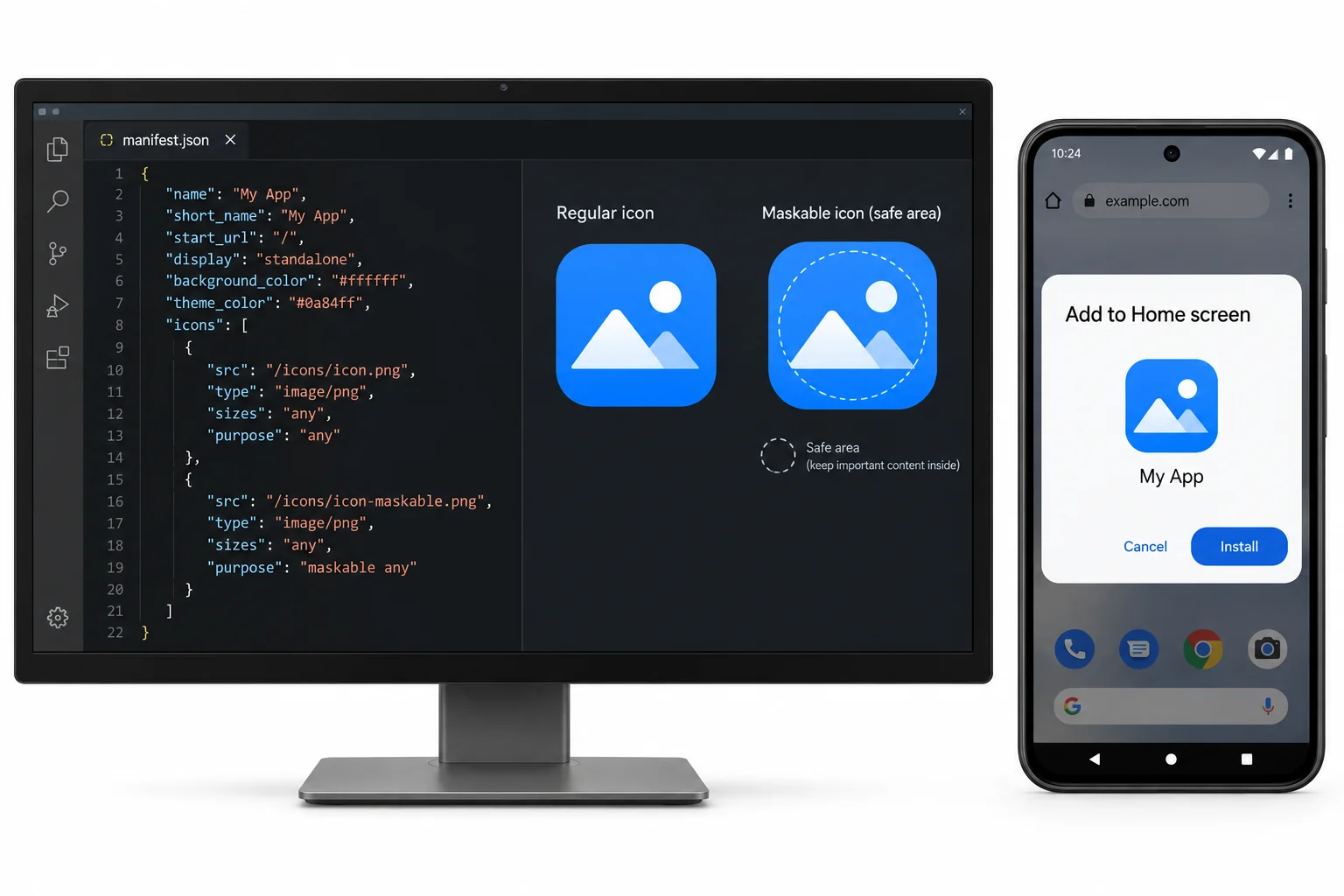
That array lists each icon by its file, its pixel size and how it is meant to be used. Get the sizes and that last part, the purpose, right and the icon installs cleanly on every phone.
The Two Sizes, 192 and 512
Two PNG files carry the base case. Chrome leans on the 192 for the install prompt and the shortcut sitting on the home screen. It calls on the 512 for the splash screen that shows while the app opens and for any higher resolution display.
You can add the sizes in between for hand tuned sharpness, though Chrome scales between the two on its own, so 192 and 512 are the working minimum. The full table of which size lands where sits in the guide on favicon sizes.
Maskable Icons and the Safe Zone
This is the piece that trips people. Since Android 8, the system reshapes every installed icon to match the phone, a circle on one, a squircle on another, a rounded square on a third. Hand it a plain square icon and it shrinks yours onto a white circle to fill the shape.
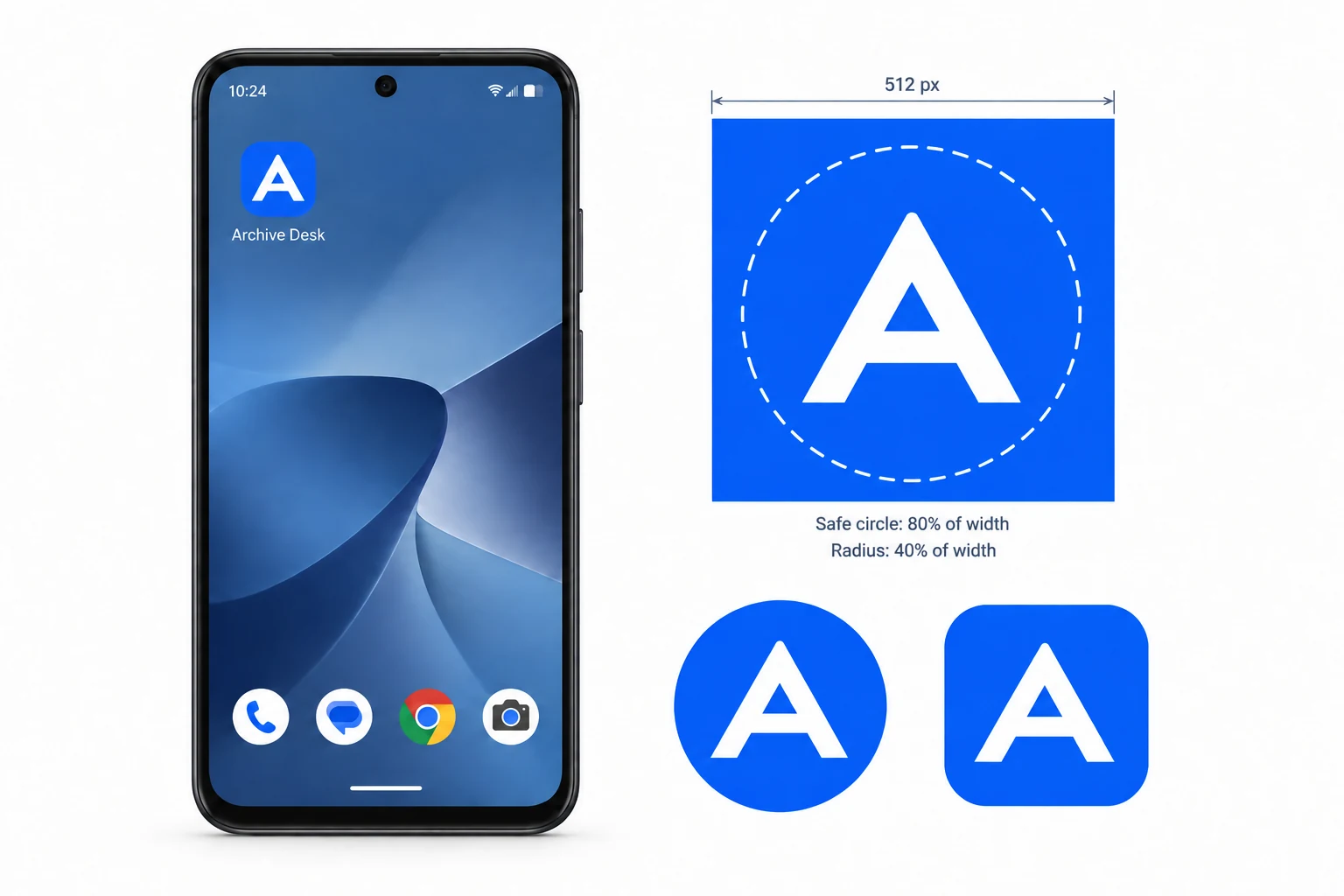
A maskable icon fixes it. You supply an opaque image with padding built in, and the browser crops it to whatever shape the phone applies. Because the crop varies, there is a standard safe zone to design against. As the web.dev guide to maskable icons sets it out, keep the important part of the icon inside a centre circle with a radius of 40 percent of the width. The outer tenth on each side may be shaved off.
The purpose Field
Each icon entry can carry a purpose, and it decides how the browser treats the image. Leave it out and the icon defaults to any, drawn as supplied, which on Android means dropped on that white circle. Set it to maskable and the browser knows the image has padding and crops it to the device shape instead. A third value, monochrome, is for notification badges.
It is tempting to write any maskable on one file and be done. Skip that. A maskable icon carries padding, so pressed into service as a plain icon it looks small and adrift in empty space. Ship two files, one drawn full for any and one padded for maskable.
Make the PWA PNGs
The icons are opaque PNGs at set sizes, and the Univik ICO Converter exports them from your artwork.
- Prepare two framingsA full bleed version of your mark, and a padded version with the logo pulled into the centre.
- Export the plain iconsSave a 192 and a 512 PNG from the full version on a solid background.
- Export the maskable oneSave a 512 PNG from the padded version, logo inside the safe circle.
- List them in the manifestAdd the three files with their sizes and purpose.
If your mark is a vector, the SVG to ICO guide covers drawing these raster sizes from it cleanly. Building the whole icon set at once, not just the PWA part, is laid out in the pillar on adding a favicon to a website.
Turn your artwork into the 192 and 512 PNGs a manifest needs, opaque and square, ready to list with their purpose next to a padded maskable version.
Free Download See All FeaturesThe Icons in Your Manifest
The manifest is a JSON file, linked from your head, that turns a site into something installable. Its icons array is the part that matters here, though the surrounding fields name the app. MDN's manifest reference and web.dev's manifest guide document the full field list.
{
  "name": "Your Site",
  "short_name": "Site",
  "start_url": "/",
  "display": "standalone",
  "icons": [
    { "src": "/icon-192.png", "sizes": "192x192", "type": "image/png", "purpose": "any" },
    { "src": "/icon-512.png", "sizes": "512x512", "type": "image/png", "purpose": "any" },
    { "src": "/icon-maskable.png", "sizes": "512x512", "type": "image/png", "purpose": "maskable" }
  ]
}
Three entries do the work, two plain sizes and one maskable. The display and start_url lines above are what let the app open standalone from the home screen rather than in a browser tab.
Keep the Icons Opaque
Every PWA icon wants a solid background, the same rule the Apple icon follows. A transparent PNG might look fine in preview, but Android and iOS both fill the clear area with a background colour of their own choosing when the icon is installed.
So export the plain and maskable icons on your brand colour or white. It keeps the result predictable across phones instead of leaving the background to chance.
Common PWA Icon Mistakes
When a PWA icon installs badly, a few things explain it.
Ship the two plain sizes, add a padded maskable version and keep them all opaque, and the app installs with a clean icon on any phone. Designing a mark that still holds up once a phone crops it is covered under Windows style app icons. To inspect what a live site declares, the guide on getting a favicon from a website shows how.
Frequently Asked Questions

Written and maintained by Leena Taylor Paul and the Univik team, developers of Windows data conversion and recovery software since 2013. The PWA icon that trips people is the maskable one, install a site to an Android home screen without it and the logo shrinks inside a white circle, so this guide spends its time on the safe zone that fixes that. Last verified August 2026. Icon lost in a white circle? Contact our support team.