An apple-touch-icon is one 180 pixel PNG that iOS uses for a home screen shortcut, and it breaks two rules that favicons follow, no transparency and no rounded corners. iOS fills clear areas with black and adds its own rounded mask. The Univik ICO Converter builds the 180 pixel PNG from your artwork.
The apple-touch-icon is the odd one out in a favicon set. It follows Apple's rules, not the web's, and those rules run opposite to what a browser tab wants. Miss the difference and a logo that looks perfect in a tab turns into a dark smudge on an iPhone.
It is a small file with a couple of firm rules. Get those right and it takes five minutes.
What the Apple Touch Icon Does
When someone taps Share and then Add to Home Screen in Safari, iOS needs an icon for the shortcut it creates. It does not look in the web app manifest for that icon, the way Android does. It looks for a tag marked apple-touch-icon and, failing that, a file at your site root with that name.
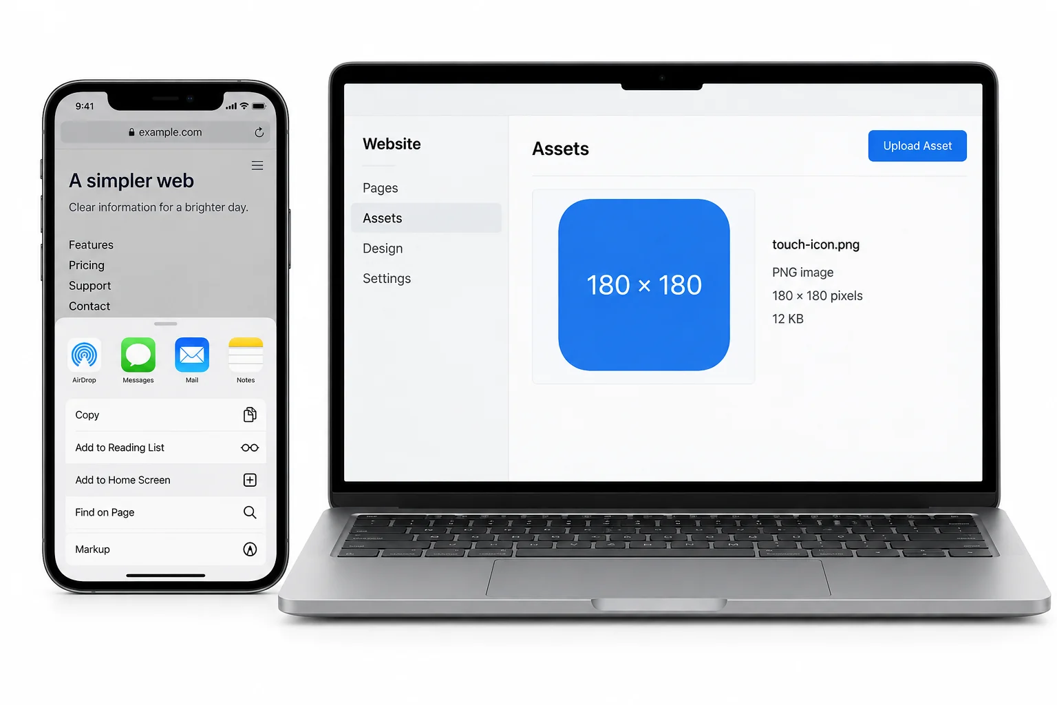
Because Safari skips the manifest here, this icon is its own separate job even on a site that already ships one. Leave it out and iOS falls back to a shrunken snapshot of the page, which reads as a bug rather than a brand.
One Size, 180 by 180
A single 180 pixel square PNG is the whole answer for current devices, the approach Apple uses on its own site as Mathias Bynens documents. iOS takes that one file and scales it down wherever it needs something smaller, so the long list of legacy sizes, 57, 76, 120, 152 and the rest, no longer earns a place in your folder.
The format is fixed too. Apple wants a PNG here, not the SVG a modern browser tab uses or the .ico that serves as the old fallback. The right sizes for those other files sit in the guide on favicon sizes.
Never Use Transparency
This is the rule that catches almost everyone. A browser tab icon wants a transparent background so it sits cleanly on any tab colour. The apple-touch-icon wants the exact opposite. iOS does not read the alpha channel on a home screen icon, so every clear pixel is painted black.
So flatten the icon onto a background first. Your brand colour works well, since it makes the icon stand out against whatever wallpaper a person uses, and plain white is a safe default. The point is that nothing behind the mark stays see through.
Do Not Round the Corners
The second rule is the mirror of the first surprise. iOS draws every home screen icon inside its own rounded square mask, the soft cornered shape you see on app icons. You hand it a full square and it does the shaping.
The same goes for shadows. iOS may add a subtle one of its own, so a shadow baked into your art doubles up and muddies the icon. Keep the artwork flat and square and let the system add the polish.
Make the 180 Pixel PNG
Building the file is quick once the two rules are clear. The Univik ICO Converter turns your artwork into the 180 pixel PNG the icon needs.
- Start on a solid backgroundGive the converter artwork sitting on your brand colour or white, not on transparency.
- Export at 180Save a 180 by 180 pixel PNG, the one size current iOS wants.
- Keep it squareLeave the corners sharp and the frame full, since iOS handles the rounding.
- Name and place itSave it as apple-touch-icon.png in your site root.
A vector logo can produce this PNG directly, and rendering a clean raster from one is walked through in the SVG to ICO guide. Whole favicon set to build? The pillar on adding a favicon to a website lays out every file at once.
Turn one image into the 180 pixel Apple PNG plus the favicon.ico and manifest sizes, so the whole set comes out of a single source with the transparency handled per file.
Free Download See All FeaturesThe Link Tag and Where the File Goes
One line in your page head points iOS at the file. The tag is <link rel="apple-touch-icon" href="/apple-touch-icon.png">, and an optional sizes="180x180" spells out the dimension.
iOS also finds a file named apple-touch-icon.png in your site root by itself, with no tag present at all, the same way it finds favicon.ico. The explicit tag is still worth adding, since it is the reliable path and it lets you point at a different filename if you need to.
You Can Ignore Precomposed
Old favicon guides mention a second form, apple-touch-icon-precomposed, and it is safe to skip now. It exists for a reason that has expired.
Early iOS added a glossy highlight to every home screen icon, and the precomposed keyword told it to leave your art alone. Apple dropped that gloss back in iOS 7, so the plain and precomposed forms now behave the same. As the webhint guide to touch icons notes, there is no need to ship the precomposed variant any more. One apple-touch-icon covers it.
Common Apple Touch Icon Mistakes
Most apple-touch-icon trouble comes down to a handful of slips.
Keep it opaque, keep it square and keep it present, and the icon lands as a proper app style tile on the home screen. Designing a mark that reads at the small size iOS draws it is its own craft, set out under Windows style app icons. To check what another site ships, getting a favicon from a website shows how to inspect one.
Frequently Asked Questions

Written and maintained by Leena Taylor Paul and the Univik team, developers of Windows data conversion and recovery software since 2013. The apple-touch-icon trips people in a way favicons never do. A transparent logo that looks perfect in a browser tab turns into a dark blob on an iPhone, so this guide leads with the two rules that decide it, no transparency and no rounded corners. Last verified August 2026. Icon black on the home screen? Contact our support team.