An app looks native on Windows when its icons match three things, the metaphor, the visual style and the size set Windows expects. Use the built in Fluent icon font for glyphs inside your interface, design a metaphor driven app icon for the shell, then ship it at 16, 24, 32, 48 and 256 pixels. The Univik ICO Converter packages your finished art into a single multi size ICO.
You can have beautiful artwork and still have an app that feels foreign on Windows. The gap is rarely talent. It is a mismatch in one of a few specific places, the wrong metaphor, a clashing style or a missing size that leaves an icon blurry on a taskbar.
This is the map for closing that gap. It gathers the rules that make icons feel native and points to the deeper guides for each piece, so you can go as shallow or as far as your project needs.
What Makes an Icon Feel Native
Native is not a mystery, it is three habits working together. Microsoft's own design guidelines for Windows app icons come down to the same handful of ideas, and they hold whether you draw the art or borrow it.
The App Icon and the Interface Glyphs
Here is the split most guides skip. A Windows app carries two very different kinds of icons, and each has its own rules. The app icon is the single picture that stands for your product in the taskbar, the Start menu and on the EXE. The interface glyphs are the small pictures inside your window, on toolbars, buttons, navigation and status.
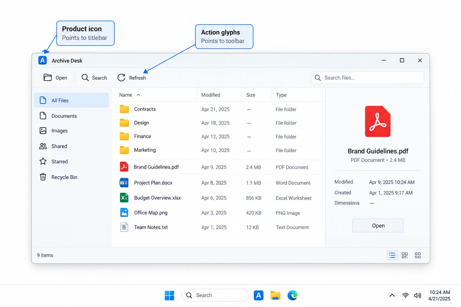
Treating them the same is the first wrong turn. The app icon wants a rich, layered metaphor built for large sizes down to tiny ones. The glyphs want a lean, uniform set that reads instantly at 16 pixels. Different jobs, different sources, which the next two sections cover in turn.
Use the Fluent Font for Interface Glyphs
For the glyphs inside your interface, Windows already hands you a native set. Windows 11 ships Segoe Fluent Icons, a system font of more than a thousand glyphs drawn in a single stroke monoline style. Because they come from a font, they stay crisp at any size and any resolution without you shipping a single image.
This route quietly solves two problems at once. Your toolbar and navigation match the rest of Windows 11 by default, and you sidestep the rights question that comes with reusing artwork pulled from a system file. For in app iconography, reach for the font first and only draw custom glyphs where the font has a genuine gap. The one caveat is version. Segoe Fluent Icons ships with Windows 11, while Windows 10 falls back to the older Segoe MDL2 Assets font.
Design the App Icon Around a Metaphor
The app icon carries more weight, so it earns real design time. Microsoft's guidance is consistent, build the picture around your app's core purpose expressed as a single metaphor, keep the silhouette balanced and legible, then use as few shapes and corners as you can. Detail belongs only on the most prominent layer, and colour should support the shape rather than carry the meaning alone.
Keep gradients subtle and layers few, since heavy effects fall apart when the icon shrinks. Build it on a transparent background so Windows can theme it cleanly. When the art is ready, the last step is packaging it into a proper icon file, which converting PNG to ICO walks through step by step.
Where to Source Extra Glyphs
When the Fluent font runs short and you need more than your own hand can draw quickly, three other sources exist. Each suits a different need, and each carries a different rights weight.
| Source | Best for | Watch for |
|---|---|---|
| Windows system files | Studying the exact native look | Rights, do not ship the art |
| Fluent icon font | In app toolbar and status glyphs | Built in, no image files |
| Visual Studio Image Library | Extra object and action glyphs | Licence terms apply |
| Your own art | Anything unique to your product | Yours to ship freely |
The Windows files are best treated as a reference, and you can see them all in one place, where Windows stores its icons, with the individual sets broken out in the shell32.dll icon list and the imageres.dll icon list. The developer set is written up in our guide to the Visual Studio Image Library.
Ship the Full Size Set
Style gets the attention, but a missing size is what users actually notice. Microsoft's baseline for a desktop icon is 16, 24, 32, 48 and 256 pixels, packed into one ICO, so the shell always finds a match at or above the size it needs and only ever scales down. Skip a size and Windows stretches the nearest one, which is where the soft, fuzzy taskbar icon comes from.
If your product also has a web presence, the browser side of the same problem, the favicon, has its own rules laid out in favicon sizes.
Point the converter at your finished PNG or SVG and it returns a single ICO holding every size a native app needs, ready for the taskbar, the Start menu and the EXE.
Free Download See All FeaturesKnow What You Can Ship
One rule keeps a project clean. You can look at any Windows icon, learn from it and match its feel, but the artwork in the system files is Microsoft's and is not yours to redistribute inside a product you sell. That is the whole appeal of the Fluent font and the Visual Studio Image Library, both give you a native look on terms meant for developers.
If you are unsure about reusing a particular icon, whether extracted icons are legal to use sets out the full copyright and trademark picture.
Match the Look in Four Steps
Pulled together, the whole process is short.
- Pick the metaphorSettle on the one idea your app icon should show, then design it around that with a balanced, legible silhouette.
- Match the current styleKeep it flat and layered with subtle colour, so it sits beside Windows 11 art without clashing.
- Use Fluent for UI glyphsWire your toolbar, navigation and status icons to the Segoe Fluent Icons font rather than shipping images.
- Export the size setBuild one ICO holding 16, 24, 32, 48 and 256 pixels so every surface gets a sharp match.
For a walk through built around a specific kind of app, the routing by need is in our guides to native icons for a database or admin tool and network and connection icons.
Frequently Asked Questions

Written and maintained by Leena Taylor Paul and the Univik team, developers of Windows data conversion and recovery software since 2013. We built the ICO Converter around this exact snag, teams with good artwork that still looked off on Windows because a size or a style did not line up, so this guide gathers the rules and links out to the detailed guides. Last verified August 2026. Polishing an app icon? Contact our support team.